

GESTALT Theory & Interference Patterning in AI API (Application Programming Interface)
If you’ve spent any time arranging type, images, or UI elements and thought, “this just feels right,” you’ve already brushed up against Gestalt theory, even if you weren’t able to name it. It’s one of those foundational ideas in design that quietly shapes everything from logos to app layouts, not through rigid rules but through how people naturally perceive structure. Gestalt theory comes out of early 20th-century psychology, largely through thinkers like Max Wertheimer, Wolfgang Köhler, and famous German psychologist Kurt Koffka (*not to be mistaken with Jewish-Czech author Franz Kafka). The core idea is simple, diagnosing that people don’t perceive visual elements in isolation. We see overall forms, patterns, and relationships first, details second. For designers, that translates into a powerful reality: composition isn’t just what you place, it’s how the viewer organizes it in their mind.
The Psychological Pull of Key Gestalt Principles:
Proximity → Grouping Without Borders: Elements placed close together are perceived as related. You don’t need lines or boxes because spacing does the heavy lifting. Psychologically speaking, this reduces cognitive load. The brain chunks information automatically, making layouts feel cleaner and easier to scan. That’s why good UI design often relies more on spacing than visible separators.
Similarity → Visual Identity and Rhythm: When elements share color, shape, or size, users group them instantly. This creates consistency and predictability; two key ingredients for building trust. In branding, similarity reinforces identity; in interfaces, it signals reliable function and eases any call-to-action prompt to use (i.e. “all these buttons behave the same way,”).
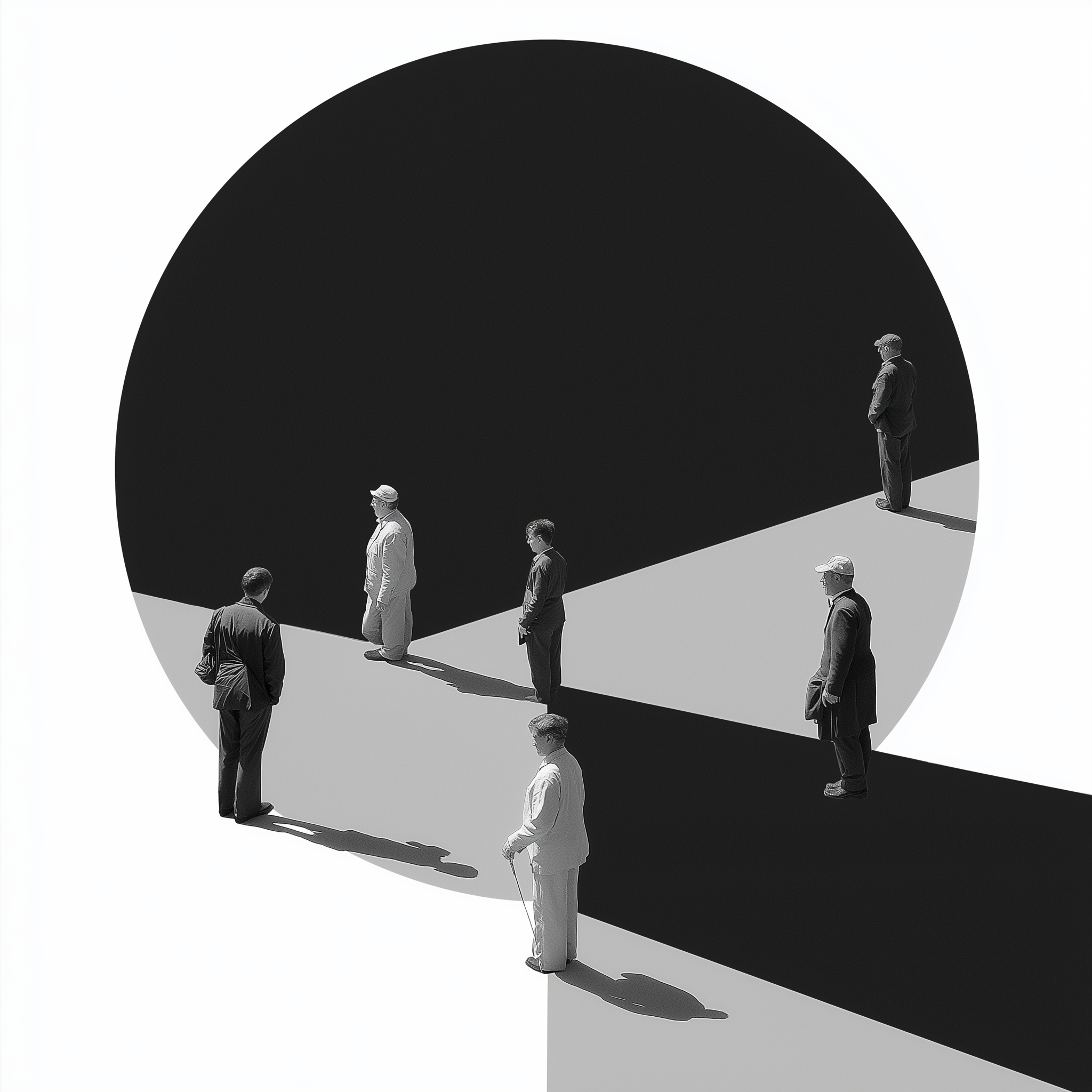
Figure–Ground → Focus and Hierarchy: We instinctively separate foreground from background. Strong contrast clarifies what matters; weak contrast creates ambiguity. Designers use this to guide attention. What ever pops forward gets visual priority. When this balance is off, users can feel disoriented without always knowing why.
Continuity → Flow and Direction: The eye prefers smooth, continuous paths. We follow lines, curves, and alignments almost subconsciously. This is where layout becomes narrative. A well-aligned composition can “lead” the viewer through content without explicit instruction.
Closure → The Power of Suggestion: People naturally fill in missing information to perceive a complete form. This is why minimal logos work: you don’t have to show everything—just enough. Closure engages the viewer, making them an active participant in the design.
Why It Works
Gestalt principles are effective because they align with how the brain optimizes perception. Humans evolved to process complex environments quickly, so we naturally rely on visual shortcuts such as grouping, pattern recognition, contrast detection. Good design leverages these shortcuts with didactive purpose. Instead of forcing users to interpret every element individually, it pre-organizes meaning. The result is a composition that feels intuitive, even inevitable.
Bad design, on the other hand, fights these instincts. It creates friction—not always visibly, but cognitively. Such is the power of visual language that it can also cause viewers to hesitate, misinterpret, or disengage; which in turn can lead to unique failures in messaging.
The nature of this duality is the designer’s balancing act. Gestalt principles present valuable insights into understanding visual composition, they certainly aren’t rigid laws. They often compete. Strong similarity can override proximity, bold figure-ground contrast can disrupt continuity, or too much closure can be more confusing than intruiging. So in reality, composition becomes less about applying rules and more about tuning perception. As willing participants in this endeavor, designers must constantly weigh what the viewer should group, ignore, or follow…and then adjust visual signals accordingly.
AI and the Interference Pattern
AI design tools introduce a strange twist to Gestalt thinking. On one hand, machine learning models are exceptionally good at reproducing Gestalt-like compositions because they’re trained on massive datasets of “successful” visuals. They can ‘instantly’ generate layouts with convincing hierarchy, spacing, and flow. But there’s a catch: AI doesn’t perceive Gestalt the same way humans do; it statistically imitates it. That means it can overfit patterns, producing designs that follow principles like proximity or similarity but are lacking intentional tension or conceptual clarity. Everything can start to feel correct but generic.
More interestingly, AI can disrupt Gestalt expectations in subtle ways. Slight inconsistencies in alignment, spacing, or figure–ground relationships—often artifacts of generative systems—can create low-level cognitive dissonance. The viewer may not consciously notice, but the composition feels “off.” ‘The uncanny valley’, as it is termed, is as serious as a bear trap. As more media becomes ‘social-ized’, and more humans experience media through ‘second-screen’ dynamics, we grow less able to differentiate truth from fiction. So the designer’s role shifts. Instead of just applying Gestalt principles, you’re now editing and reasserting them—correcting, exaggerating, or even breaking AI-generated patterns to restore intentional perception. In a way, AI provides ways we can push Gestalt back into focus and reclaim visual coherence and meaning…but we have to bear the universal responsibility of making it so…otherwise it’s just a mirror of our worst ideas.
~a.d.